How to Visualize Simply with Python
In this blog post, we will be visualizing data from the Palmer Penguins Dataset, which provides us details about penguins across three unique species.
Getting the Data
We will obtain the data from an online github repository with read.csv().
# importing the data
import pandas as pd
import numpy as np
url = "https://raw.githubusercontent.com/PhilChodrow/PIC16B/master/datasets/palmer_penguins.csv"
penguins = pd.read_csv(url)
penguins.head()
| studyName | Sample Number | Species | Region | Island | Stage | Individual ID | Clutch Completion | Date Egg | Culmen Length (mm) | Culmen Depth (mm) | Flipper Length (mm) | Body Mass (g) | Sex | Delta 15 N (o/oo) | Delta 13 C (o/oo) | Comments | |
|---|---|---|---|---|---|---|---|---|---|---|---|---|---|---|---|---|---|
| 0 | PAL0708 | 1 | Adelie Penguin (Pygoscelis adeliae) | Anvers | Torgersen | Adult, 1 Egg Stage | N1A1 | Yes | 11/11/07 | 39.1 | 18.7 | 181.0 | 3750.0 | MALE | NaN | NaN | Not enough blood for isotopes. |
| 1 | PAL0708 | 2 | Adelie Penguin (Pygoscelis adeliae) | Anvers | Torgersen | Adult, 1 Egg Stage | N1A2 | Yes | 11/11/07 | 39.5 | 17.4 | 186.0 | 3800.0 | FEMALE | 8.94956 | -24.69454 | NaN |
| 2 | PAL0708 | 3 | Adelie Penguin (Pygoscelis adeliae) | Anvers | Torgersen | Adult, 1 Egg Stage | N2A1 | Yes | 11/16/07 | 40.3 | 18.0 | 195.0 | 3250.0 | FEMALE | 8.36821 | -25.33302 | NaN |
| 3 | PAL0708 | 4 | Adelie Penguin (Pygoscelis adeliae) | Anvers | Torgersen | Adult, 1 Egg Stage | N2A2 | Yes | 11/16/07 | NaN | NaN | NaN | NaN | NaN | NaN | NaN | Adult not sampled. |
| 4 | PAL0708 | 5 | Adelie Penguin (Pygoscelis adeliae) | Anvers | Torgersen | Adult, 1 Egg Stage | N3A1 | Yes | 11/16/07 | 36.7 | 19.3 | 193.0 | 3450.0 | FEMALE | 8.76651 | -25.32426 | NaN |
| ... | ... | ... | ... | ... | ... | ... | ... | ... | ... | ... | ... | ... | ... | ... | ... | ... | ... |
| 339 | PAL0910 | 120 | Gentoo penguin (Pygoscelis papua) | Anvers | Biscoe | Adult, 1 Egg Stage | N38A2 | No | 12/1/09 | NaN | NaN | NaN | NaN | NaN | NaN | NaN | NaN |
| 340 | PAL0910 | 121 | Gentoo penguin (Pygoscelis papua) | Anvers | Biscoe | Adult, 1 Egg Stage | N39A1 | Yes | 11/22/09 | 46.8 | 14.3 | 215.0 | 4850.0 | FEMALE | 8.41151 | -26.13832 | NaN |
| 341 | PAL0910 | 122 | Gentoo penguin (Pygoscelis papua) | Anvers | Biscoe | Adult, 1 Egg Stage | N39A2 | Yes | 11/22/09 | 50.4 | 15.7 | 222.0 | 5750.0 | MALE | 8.30166 | -26.04117 | NaN |
| 342 | PAL0910 | 123 | Gentoo penguin (Pygoscelis papua) | Anvers | Biscoe | Adult, 1 Egg Stage | N43A1 | Yes | 11/22/09 | 45.2 | 14.8 | 212.0 | 5200.0 | FEMALE | 8.24246 | -26.11969 | NaN |
| 343 | PAL0910 | 124 | Gentoo penguin (Pygoscelis papua) | Anvers | Biscoe | Adult, 1 Egg Stage | N43A2 | Yes | 11/22/09 | 49.9 | 16.1 | 213.0 | 5400.0 | MALE | 8.36390 | -26.15531 | NaN |
344 rows × 17 columns
Cleaning the Data
Before me move on to perform advanced visualizations functions, we need to make sure our data is nice and clean to avoid errors and unintended outputs.
We are going to create a function clean_data that will:
-
Relabel
Speciescolumn to enhance readability to the viewer (For example: “Adelie Penguin (Pygoscelis adelie)” is relabeled to “Adelie”) -
Relabel
Sexcolumn (“MALE” is relabeled to “M” and “FEMALE” is relabeled to “F”) -
Return a clean dataset
def clean_data(df):

    """
    This function does the following:

    1. Relabel Species column to enhance readability to the viewer (For example: "Adelie Penguin (Pygoscelis adelie)" is relabeled to "Adelie")
    2. Relabel Sex column ("MALE" is relabeled to "M" and "FEMALE" is relabeled to "F")
    3. Return a clean dataset

    """

    # create a copy
    df_copy = df.copy()

    # making the labels using dictionaries
    species_labels = { 'Adelie Penguin (Pygoscelis adeliae)': 'Adelie',
                       'Chinstrap penguin (Pygoscelis antarctica)': 'Chinstrap',
                       'Gentoo penguin (Pygoscelis papua)': 'Gentoo' }

    sex_labels = { "MALE": 'M',
                   "FEMALE": 'F',
                   ".": np.nan }

    # relabeling the columns
    df_copy["Species"] =  df_copy["Species"].map(species_labels)
    df_copy["Sex"] = df_copy["Sex"].map(sex_labels)

    return df_copy
# the new clean and shiny dataframe
df = clean_data(penguins)
df.head()
| studyName | Sample Number | Species | Region | Island | Stage | Individual ID | Clutch Completion | Date Egg | Culmen Length (mm) | Culmen Depth (mm) | Flipper Length (mm) | Body Mass (g) | Sex | Delta 15 N (o/oo) | Delta 13 C (o/oo) | Comments | |
|---|---|---|---|---|---|---|---|---|---|---|---|---|---|---|---|---|---|
| 0 | PAL0708 | 1 | Adelie | Anvers | Torgersen | Adult, 1 Egg Stage | N1A1 | Yes | 11/11/07 | 39.1 | 18.7 | 181.0 | 3750.0 | M | NaN | NaN | Not enough blood for isotopes. |
| 1 | PAL0708 | 2 | Adelie | Anvers | Torgersen | Adult, 1 Egg Stage | N1A2 | Yes | 11/11/07 | 39.5 | 17.4 | 186.0 | 3800.0 | F | 8.94956 | -24.69454 | NaN |
| 2 | PAL0708 | 3 | Adelie | Anvers | Torgersen | Adult, 1 Egg Stage | N2A1 | Yes | 11/16/07 | 40.3 | 18.0 | 195.0 | 3250.0 | F | 8.36821 | -25.33302 | NaN |
| 3 | PAL0708 | 4 | Adelie | Anvers | Torgersen | Adult, 1 Egg Stage | N2A2 | Yes | 11/16/07 | NaN | NaN | NaN | NaN | NaN | NaN | NaN | Adult not sampled. |
| 4 | PAL0708 | 5 | Adelie | Anvers | Torgersen | Adult, 1 Egg Stage | N3A1 | Yes | 11/16/07 | 36.7 | 19.3 | 193.0 | 3450.0 | F | 8.76651 | -25.32426 | NaN |
| ... | ... | ... | ... | ... | ... | ... | ... | ... | ... | ... | ... | ... | ... | ... | ... | ... | ... |
| 339 | PAL0910 | 120 | Gentoo | Anvers | Biscoe | Adult, 1 Egg Stage | N38A2 | No | 12/1/09 | NaN | NaN | NaN | NaN | NaN | NaN | NaN | NaN |
| 340 | PAL0910 | 121 | Gentoo | Anvers | Biscoe | Adult, 1 Egg Stage | N39A1 | Yes | 11/22/09 | 46.8 | 14.3 | 215.0 | 4850.0 | F | 8.41151 | -26.13832 | NaN |
| 341 | PAL0910 | 122 | Gentoo | Anvers | Biscoe | Adult, 1 Egg Stage | N39A2 | Yes | 11/22/09 | 50.4 | 15.7 | 222.0 | 5750.0 | M | 8.30166 | -26.04117 | NaN |
| 342 | PAL0910 | 123 | Gentoo | Anvers | Biscoe | Adult, 1 Egg Stage | N43A1 | Yes | 11/22/09 | 45.2 | 14.8 | 212.0 | 5200.0 | F | 8.24246 | -26.11969 | NaN |
| 343 | PAL0910 | 124 | Gentoo | Anvers | Biscoe | Adult, 1 Egg Stage | N43A2 | Yes | 11/22/09 | 49.9 | 16.1 | 213.0 | 5400.0 | M | 8.36390 | -26.15531 | NaN |
344 rows × 17 columns
But What to Visualize?
There are many visualizations we can attempt with this data in order to facilitate our understanding of these penguins. But for now, let’s assess how big each species is relative to each other. We can get valuable insights to answer this question by analyzing the Body Mass (g) feature of our dataset.
We can also analyze if being on certain islands affects the size of our penguins.
The Task: We will plot 3 figures representing each island and visualize penguin mass with histograms for each species within the figure.
Let’s Start to Visualize!
Let’s import our powerful visualization packages first, Seaborn & Matplotlib, and start visualizing penguins!
import seaborn as sns
from matplotlib import pyplot as plt
1. Make a figure.
We make a figure in which are plots will be embedded in.
This is done by the command:
#Fill in the figsize parameter to set the (width,height) of the figure.
plt.figure(figsize = (10,20)).
Now, we have a space ready to fill in with our data visualizations.
2. Make sub plots if you want multiple plots.
Our aim is visualize 3 histograms together so we will use a structure with 1 row and 3 columns; the first plot is represented by:
plt.subplots(1,3,1) # (rows, columns, the plot)
3. Start Plotting!
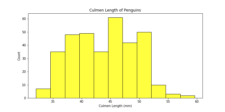
Before we move on to plot multi-histograms in one figure, let’s try and learn the basics of plotting a simple histogram first.
Let’s plot a simple histogram visualizing culmen lengths of penguins using our seaborn package.
# make the figure
plt.figure(figsize = (10,5))

# make the plot
plot = sns.histplot(data = df,
                    x = "Culmen Length (mm)",
                    color = "yellow"
                    )

# set the title of the plot
plot.set_title("Culmen Length of Penguins")
sns.histplot calls the histplot function of the seaborn package.
We have given this function the following parameters:
data: specify the dataframex: the column to plotcolor: the color of the histogram
-
Preferably, we would want to see how the distribution of
Culmen Length (mm)is different for different species. Let’s add color to differentiate among different species.
# make the figure
plt.figure(figsize = (10,5))

plot = sns.histplot(data = df,
                    x = "Culmen Length (mm)",
                    hue = "Species",
                    palette = dict( Adelie = "yellow", Gentoo = "blue", Chinstrap = "red")
                    )
# set the title of the plot
plot.set_title("Culmen Length of Penguins")
Explanation of the new parameters:
hue: groupsSpeciesby colourpalette: choose your favorite colors!
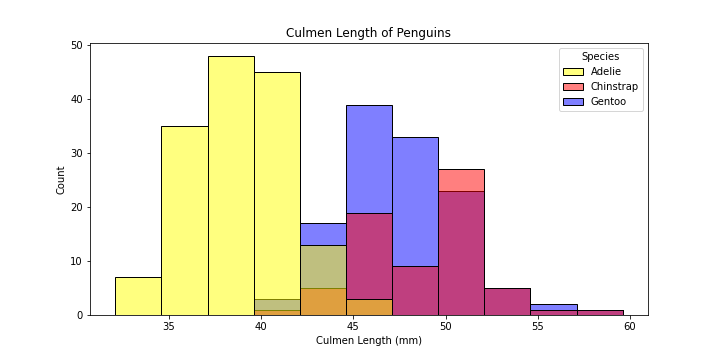
-
The plot is still a bit hard to read…let’s change the boxy shape of the bins to better visualize the variation between species better.
# make the figure
plt.figure(figsize = (10,5))

plot = sns.histplot(data = df,
                     x = "Culmen Length (mm)",
                     hue = "Species",
                     element = "poly",
                     palette = dict( Adelie = "yellow", Gentoo = "blue", Chinstrap = "green")
                     )
# set the title of the plot
plot.set_title("Culmen Length of Penguins")
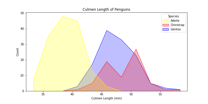
Now that is much better!
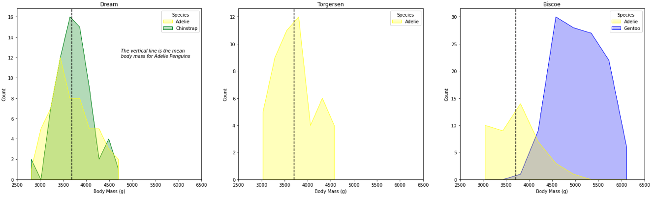
We can now explore some more advanced seaborn features and combine them to produce the visualization below to answer key question we posed earlier in the blog:
The Task: Plotting Body Mass(g) of Penguins Across Islands
plt.figure(figsize = (20,5))

# a list containing the unique island names
islands = list(set(df["Island"]))

# create the visualization

#iterate over the subplots
for i in range(1, len(islands) + 1):

    plt.subplot(1,3,i) # the subplot in the grid

    # get the subset of data according to each island
    sub_df = df[df["Island"] == islands[i-1]]

    plot = sns.histplot(data = sub_df,
                        x = "Body Mass (g)",
                        hue = "Species",
                        element = "poly",
                        palette = dict( Adelie = "yellow", Gentoo = "blue", Chinstrap = "green"))

    # we want the every x-axis to have the same scale to compare the penguins
    plot.set(xlim =(2500,6500))

    # set title of subplot to the island name
    plt.title(islands[i-1])

    # Plotting the vertical lines for mean body mass of Adelie Penguins

    # mean of Body Mass of Adelie penguins
    group = sub_df.groupby("Species")["Body Mass (g)"].mean()

    # add a vertical line
    plt.axvline(group[0], ls = '--', color = 'black', label = "Adelie mean")

    # adding text
    if i == 1:
        plt.text(4750, 12, "The vertical line is the mean \nbody mass for Adelie Penguins", size = 10, style = 'italic')
Explanation of the new arguments and functions:
-
element: smoothen the boxy histogram -
plt.axvline: add a vertical line at the given coords -
plt.text: add text to the plot