
Visualizing Climate Change with Python

Let’s take a breather for a moment and appreciate how cute these Polar bears are!
It’s extremely sad to see that their habitat shrinks significantly every year and their existence threatens to be restricted only to our phone wallpapers and not the majestic arctic tundra.
We need to do something about climate change and it starts from educating ourselves about the science of climate change and seeing the data for ourselves.
Let’s get started!
The Data
For the purpose of plotting climate visualizations, we will be using data from three tables:
1. The Stations Data
This table provides information about weather station IDs, their names, and polar locations.
| ID | LATITUDE | LONGITUDE | STNELEV | NAME | |
|---|---|---|---|---|---|
| 0 | ACW00011604 | 57.7667 | 11.8667 | 18.0 | SAVE |
| 1 | AE000041196 | 25.3330 | 55.5170 | 34.0 | SHARJAH_INTER_AIRP |
| 2 | AEM00041184 | 25.6170 | 55.9330 | 31.0 | RAS_AL_KHAIMAH_INTE |
| 3 | AEM00041194 | 25.2550 | 55.3640 | 10.4 | DUBAI_INTL |
2. The Country Codes Data
This table lists the FIPS 10-4 codes which are unique to every country. We can use these codes to determine the country of a weather station (notice: the ID of the weather station contains the FIPS 10-4 code of the country it’s located in).
| FIPS 10-4 | ISO 3166 | Name | |
|---|---|---|---|
| 0 | AF | AF | Afghanistan |
| 1 | AX | - | Akrotiri |
| 2 | AL | AL | Albania |
| 3 | AG | DZ | Algeria |
3. The Temperatures Data
This table is fundamental to create climate visualizations: it lists the temperature readings of thousands of stations across the planet, for every month, since the past 100 years or so.
| ID | Year | VALUE1 | VALUE2 | VALUE3 | VALUE4 | VALUE5 | VALUE6 | VALUE7 | VALUE8 | VALUE9 | VALUE10 | VALUE11 | VALUE12 | |
|---|---|---|---|---|---|---|---|---|---|---|---|---|---|---|
| 0 | ACW00011604 | 1961 | -89.0 | 236.0 | 472.0 | 773.0 | 1128.0 | 1599.0 | 1570.0 | 1481.0 | 1413.0 | 1174.0 | 510.0 | -39.0 |
| 1 | ACW00011604 | 1962 | 113.0 | 85.0 | -154.0 | 635.0 | 908.0 | 1381.0 | 1510.0 | 1393.0 | 1163.0 | 994.0 | 323.0 | -126.0 |
| 2 | ACW00011604 | 1963 | -713.0 | -553.0 | -99.0 | 541.0 | 1224.0 | 1627.0 | 1620.0 | 1596.0 | 1332.0 | 940.0 | 566.0 | -108.0 |
| 3 | ACW00011604 | 1964 | 62.0 | -85.0 | 55.0 | 738.0 | 1219.0 | 1442.0 | 1506.0 | 1557.0 | 1221.0 | 788.0 | 546.0 | 112.0 |
Let’s obtain the data from URLs into pandas dataframes
# importing packages
import pandas as pd
import numpy as np
# getting the stations
url = f"https://raw.githubusercontent.com/PhilChodrow/PIC16B/master/datasets/noaa-ghcn/station-metadata.csv"
stations = pd.read_csv(url)
# getting the country codes data
url = f"https://raw.githubusercontent.com/mysociety/gaze/master/data/fips-10-4-to-iso-country-codes.csv"
countries = pd.read_csv(url)
# getting the temperature data
temps = pd.read_csv("/Users/shreeshagarwal/Desktop/PIC16/Datasets/temps.csv")
Cleaning the temperatures data
We need to transform the temperatures data into a more desirable format in which the columns representing the 12 months are stacked into a single column.
Let’s make a function for this purpose:
def prepare_df(df):
df = df.set_index(keys=["ID", "Year"])
df = df.stack()
df = df.reset_index()
df = df.rename(columns = {"level_2" : "Month" , 0 : "Temp"})
df["Month"] = df["Month"].str[5:].astype(int)
df["Temp"] = df["Temp"] / 100
return(df)
temps = prepare_df(temps)
temps.head()
| ID | Year | Month | Temp | |
|---|---|---|---|---|
| 0 | ACW00011604 | 1961 | 1 | -0.89 |
| 1 | ACW00011604 | 1961 | 2 | 2.36 |
| 2 | ACW00011604 | 1961 | 3 | 4.72 |
| 3 | ACW00011604 | 1961 | 4 | 7.73 |
| 4 | ACW00011604 | 1961 | 5 | 11.28 |
Creating a Database
Our datasets are huge! It would be computationally expensive to slice the data and obtain subsets each time we create a new visualization. Hence, we need to create a database on SQLite3 to facilitate easy access to subsets of our data.
We will import the sqlite3 package to create a database and populate it with our three tables.
import sqlite3
# create a new database
conn = sqlite3.connect("temps.db")
# adding the three dataframes to the database
# adding temps.csv
df_iter = pd.read_csv("/Users/shreeshagarwal/Desktop/PIC16/Datasets/temps.csv", chunksize = 100000)
for df in df_iter:
df = prepare_df(df)
df.to_sql("temperatures", conn, if_exists = "append", index = False)
# adding the stations data frame
stations.to_sql("stations", conn, if_exists = "replace", index = False)
# adding the countries data frame
countries.to_sql("countries", conn, if_exists = "replace", index = False)
On to Plotting
For the first plot in this blog, I would like to visualize how the average temperature of a country has increased over a span of time for a given month.
Since I am from India and it is among the countries most vulnerable to adverse effects of Climate Change, I would plot this visualization for India between the years 1980 and 2020 owing to massive industrialization of the subcontinent between this period.
The Plot Question: How has average temperature increased across different stations within a country for a given month between a span of time?
A. Perform a SQL Query
First, let’s write a SQL Query to fetch the required data from our database.
def query_climate_database(country, year_begin, year_end, month):
cmd = \
f"""
SELECT S.name, S.latitude, S.longitude, C.name, T.year, T.month, T.temp
FROM temperatures T
LEFT JOIN stations S ON T.id = S.id
LEFT JOIN countries C ON SUBSTRING(T.id,1, 2) = C.`FIPS 10-4`
WHERE T.year >= {year_begin} AND T.year <= {year_end} AND T.month == {month} AND C.name == "{country}"
"""
return pd.read_sql_query(cmd, conn)
-
SELECT: specify columns to fetch -
FROM: specify the table to fetch from LEFT JOIN: perform a join operation to merge two tables on a common columnWHERE: get the data that satisfies these conditions
Let’s have a look at our fetched data:
india_temps = query_climate_database("India", 1980, 2020, 1)
india_temps.head()
| NAME | LATITUDE | LONGITUDE | Name | Year | Month | Temp | |
|---|---|---|---|---|---|---|---|
| 0 | PBO_ANANTAPUR | 14.583 | 77.633 | India | 1980 | 1 | 23.48 |
| 1 | PBO_ANANTAPUR | 14.583 | 77.633 | India | 1980 | 1 | 23.48 |
| 2 | PBO_ANANTAPUR | 14.583 | 77.633 | India | 1980 | 1 | 23.48 |
| 3 | PBO_ANANTAPUR | 14.583 | 77.633 | India | 1980 | 1 | 23.48 |
| 4 | PBO_ANANTAPUR | 14.583 | 77.633 | India | 1980 | 1 | 23.48 |
B. Build a Helper Function
import sklearn
from sklearn.linear_model import LinearRegression
def coef(data_group):
"""
This function calculates a Linear Regression coefficient
given the predictor variable "Year" and response variable "Temps"
"""
x = data_group[["Year"]] # 2 brackets because X should be a df
y = data_group["Temp"] # 1 bracket because y should be a series
LR = LinearRegression()
LR.fit(x, y)
return LR.coef_[0]
C. The Visualization Function
We will be using 2 powerful visualization packages:
-
plotly: This package will be our main visualization toolfrom plotly import express as px pyplot: This package is required to perform necessary formattinngfrom matplotlib import pyplot as plt
def temperature_coefficient_plot(country, year_begin, year_end, month, min_obs, **kwargs):
"""
This function creates a 'carto-positron' style map which shows
stations in the specified country with their average
annual increase in temperature coefficient
measured between year_begin and year_end
for the specified month.
"""
# SQL query to get the daataset with country, year_begin, year_end, month specifications
temps = query_climate_database(country, year_begin, year_end, month)
# removing the stations with less than min_obs
df = temps.groupby(["NAME"])[["Temp"]].aggregate(len)
names = (df[df["Temp"] > 30].reset_index())["NAME"]
temps = temps[temps["NAME"].isin(np.array(names))]
# creating linear coefficients
coefs = temps.groupby("NAME").apply(coef)
coefs = coefs.reset_index()
# merge coefs with latitude and longitude columns
df = pd.merge(coefs, temps, on = ["NAME"])
df[0] = df[0].round(5)
df = df.rename(columns = {0 : "Estimated Yearly Increase in Temperature (°C)"})
# drop extra columns
df = df.drop(["Name","Year","Temp","Month"], axis = 1)
# drop the duplicate entries
df = df.drop_duplicates(subset=['NAME'])
# creating the figure
color_map = px.colors.diverging.RdGy_r
month_dict = { 1: "January", 2: "February", 3: "March", 4: "April", 5: "May", 6: "June", 7: "July", 8: "August", 9: "September", 10: "October", 11: "November", 12: "December"}
fig = px.scatter_mapbox(df,
lat = "LATITUDE",
lon = "LONGITUDE",
hover_name = "NAME",
color = "Estimated Yearly Increase in Temperature (°C)",
mapbox_style = "carto-positron",
color_continuous_scale = color_map,
zoom = 2,
title = f"Estimated Yearly Increase in Temperature (°C) in {month_dict[1]} for stations in {country}",
**kwargs
)
write_html(fig, "Fig1.html")
return fig
temperature_coefficient_plot("India", 1980, 2020, 1, 30)
Analysis
We can notice that the stations in the western part of India have faced the most significant warming between 1980-2020. This entire region which also encompasses the Southern Pakistan is popular to have the most deadly heatwaves and highest temperatures in the summer on the entire planet.
The Next Plot:
The Plot Question: How has temperature for each month changed for a country between a given time period?
- This plot will give us a one-stop visualization of how temperatures change throuch each month in a given country between a time span.
- Let’s visualize the temperatures data for Iceland, a country in the Arctic facing extreme glacier shrinkage.
A. Perform a SQL Query
def plot2_sql_query(country, year_begin, year_end):
cmd = \
f"""
SELECT C.name, T.year, T.month, T.temp
FROM temperatures T
LEFT JOIN stations S ON T.id = S.id
LEFT JOIN countries C ON SUBSTRING(T.id,1, 2) = C.`FIPS 10-4`
WHERE T.year >= {year_begin} AND T.year <= {year_end} AND C.name == "{country}"
"""
return pd.read_sql_query(cmd, conn)
B. Build a Helper Function
"""
This function calculates a z-score given an array x
"""
def z_score_calc(x):
m = np.mean(x)
s = np.std(x)
return (x - m)/s
C. The Visualization Function
def plot_heatmap(country, year_begin, year_end, z_score = False, col_scheme = 'icefire'):
"""
Creates a heatmap visualizing the average temperature measurements
for a country between year_begin and year_end for each month.
"""
# get the dataframe
df = plot2_sql_query(country, 2000,2020)
# calculate average temperature by year and month
df = df.sort_values(by=['Year', 'Month'])
df = df.reset_index()
df = df.drop(["index"], axis = 1)
# PLOT THE Z-SCORE HEATMAP
if z_score == True:
# calculate z_scores and add the column to the df
df["z"] = df.groupby(["Year","Month"])["Temp"].transform(z_score_calc)
df = df.groupby(["Year","Month"])["z"].aggregate(np.mean).to_frame()
df = df.reset_index()
# make the final df for plotting
plot_df = df.pivot("Year","Month","z")
# plot the heatmap
fig = px.imshow(plot_df,
labels = dict(x = "Month", y = "Year", color = "Z score"),
color_continuous_scale = col_scheme,
x = months,
y = np.arange(year_begin, year_end + 1),
title = f"Heatmap showing Temperature (°C) z-scores of {country} between {year_begin} and {year_end} for each Month"
)
# change the plot size
fig.update_layout(height = 1000, width = 1000)
return fig
# PLOT THE AVG TEMPERATURE HEATMAP
# group by year and month and calculate the mean
df = df.groupby(["Year","Month"]).aggregate(np.mean)
df = df.reset_index()
# make the final df for plotting
plot_df = df.pivot("Year","Month","Temp")
# plot the heatmap
fig = px.imshow(plot_df,
labels = dict(x = "Month", y = "Year", color = "Temperature"),
color_continuous_scale = col_scheme,
x = months,
y = np.arange(year_begin, year_end + 1),
title = f"Heatmap showing Temperature (°C) of {country} between {year_begin} and {year_end} for each Month"
)
# change the plot size
fig.update_layout(height = 1000, width = 1000)
return fig
plot_heatmap("Iceland", 2000,2020)
Now let’s plot the second version of this heatmap which displays the gradient of colors in terms of z-scores.
This heatmap will show us with more clarity how temperature of each month differed with respect to the mean temperature for that month.
plot_heatmap("Iceland", 2000,2020, z_score = True)
An Aesthetic Alternative: seaborn
While plotly plots are interactive, this specific plot might be more suited to the seaborn package given its useful built-in functionalities for seaborn.heatmap.
Replace the plotly code with the code below to create the same plots with seaborn.
# plot the normal heatmap
fig, ax = plt.subplots(figsize= (17,13))
ax.set_title(f"Heatmap showing Average Temperature (°C) of {country} between {year_begin} and {year_end} for each Month")
fig = sns.heatmap(plot_df, ax = ax, linewidths=.5, cmap= "coolwarm", annot = True)
# plot the z-score heatmap
fig, ax = plt.subplots(figsize= (17,13))
ax.set_title(f"Heatmap showing Temperature (°C) z-scores of {country} between {year_begin} and {year_end} for each Month")
fig = sns.heatmap(plot_df, ax = ax, linewidths=.5, cmap = "coolwarm")
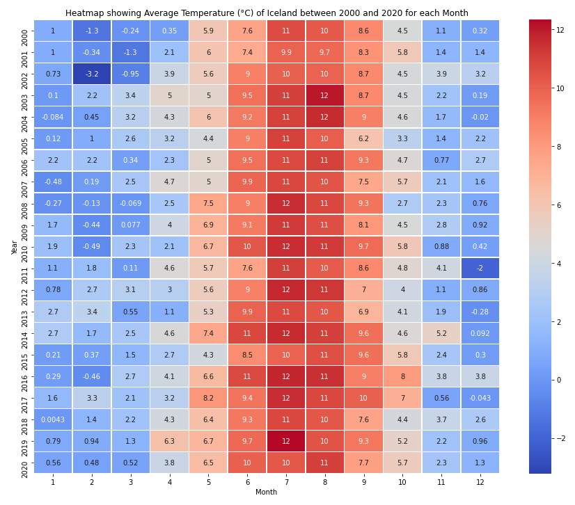
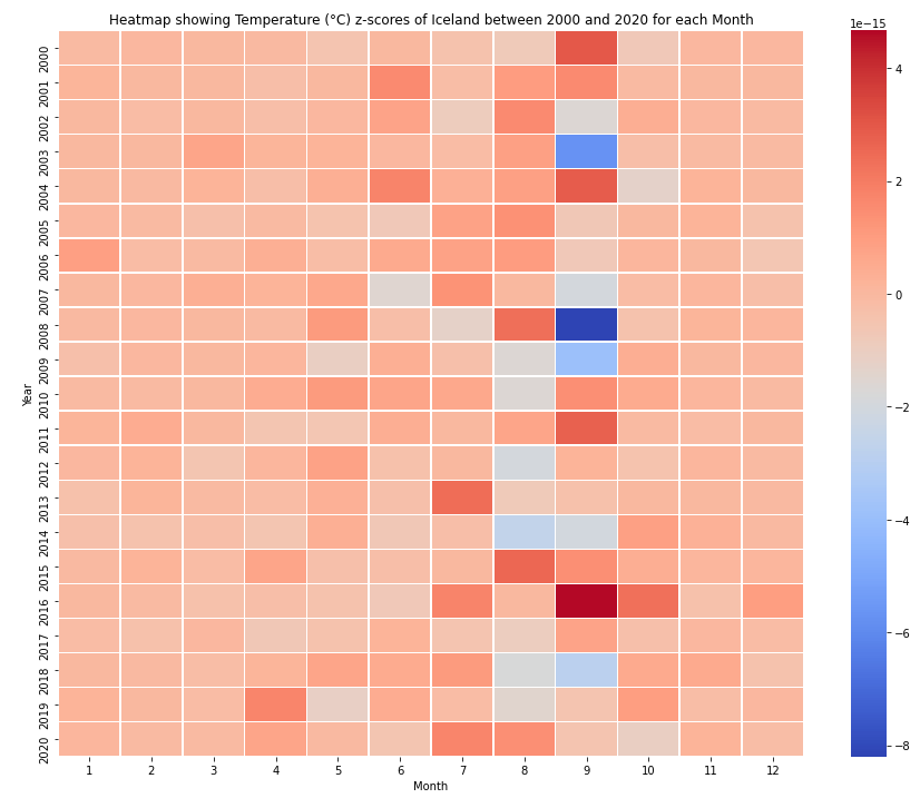
Analysis
- From the z-score heatmap we can notiice significant temperature fluctuations in the month of August.
- We also see a trend of warmer summers after 2015.
- Winter temperatures are relatively stable when compared to summer temperatures.
The Next Plot:
The Plot Question: How has median temperature changed for a country every decade?
For this plot, let’s look at Iceland again.
A. Perform a SQL Query
def plot3_sql_query(country, decade_start, decade_end):
"""
Performs a SQL query to obtain temperature data of
the specified country between specified dates.
Note: Input to decade_start, decade_end should be the last year of the decade eg 2019.
"""
cmd = \
f"""
SELECT C.name, T.year, T.temp
FROM temperatures T
LEFT JOIN stations S ON T.id = S.id
LEFT JOIN countries C ON SUBSTRING(T.id,1, 2) = C.`FIPS 10-4`
WHERE T.year >= {decade_start} AND T.year <= {decade_end} AND C.name == "{country}"
"""
return pd.read_sql_query(cmd, conn)
B. Create Visualization Function
def plot_boxplots(country, decade_begin, decade_end):
"""
This function creates a boxplot of temperatures of a country
for every decade between decade_begin and decade_end.
"""
# getting the data
df = plot3_sql_query(country, decade_begin, decade_end)
# making the decades array
years = np.arange(decade_begin, decade_end + 1).tolist()
decades = [years[i:i+10] for i in range(0, len(years), 10)]
# empty dataframe for stacking
df2 = pd.DataFrame()
# making and appending the decade column
for i in range(0,len(decades)):
df_d1 = df[df["Year"].isin(decades[i])]
df_d1["Decade"] = f"{decades[i][0]} - {decades[i][9]}"
frames = [df2, df_d1]
df2 = pd.concat(frames)
# create the plot
fig = px.box(df2,
y = "Decade",
x = "Temp",
title= f"Boxplot showing Median Temperature (°C) of {country}
for each decade between {decade_begin} and {decade_end + 1}",)
# save the plot
write_html(fig, "Fig4.html")
return fig
plot_boxplots("Iceland", 1970, 2019)
Analysis
The plots show the median temperature in Iceland rising over each decade between 1980-2019.